Transforming a north-facing room isn’t about fighting its nature with generic tricks; it’s about mastering the physics of light. The key lies not in simply adding mirrors or painting walls white, but in understanding how to scientifically manipulate light reflection, color temperature, and photon pathways to create a space that is both bright and full of sophisticated atmosphere.
The north-facing living room is often considered the most challenging space in a home. It receives no direct sunlight, only cool, indirect light that can make a room feel dim, cold, and unwelcoming. Many homeowners resign themselves to this fate, attempting to combat the gloom with the usual advice: add a mirror, paint everything white, and hope for the best. These are not incorrect strategies, but they are incomplete. They treat the symptoms of low light without addressing the fundamental principles of optical science and architectural design.
A truly illuminated space is born from a deeper understanding of light itself. It’s about knowing why a high-gloss finish outperforms a matte one, how the color temperature of an LED bulb can either complement or clash with northern light, and how even the strategic pruning of a single tree branch can become an act of interior design. It involves recognizing that light has a value—a Light Reflectance Value (LRV)—and that every surface in your room either absorbs or amplifies it. The goal is to move beyond simple decoration and become a conductor of light, directing its flow and shaping its quality.
But what if the true secret wasn’t just about maximizing lumens, but about crafting an atmosphere? This guide takes an architect’s approach to the north-facing room. We will deconstruct the science behind the most effective light-enhancing strategies, moving from the reflective power of surfaces to the precise control of artificial and even external light sources. By understanding the ‘why’ behind each technique, you will gain the expertise to not just brighten your living room, but to transform it into a refined and inviting sanctuary.
This article provides a detailed exploration of the core principles for mastering light in your home. Below is a summary of the key areas we will cover, from the physics of reflection to the art of color selection.
Summary: The Architect’s Blueprint for a Luminous Living Space
- Why placing a mirror opposite the window doubles the lumen count?
- Sheer Curtains vs. Blinds: Which allows privacy without blocking photons?
- The matte paint mistake that absorbs light instead of bouncing it
- How pruning a single tree branch can change your living room’s atmosphere?
- When to evaluate the light in a room before choosing a paint color?
- Why replacing a 60W bulb with a 9W LED maintains the same brightness?
- Which Color Palettes Promote Relaxation in a Master Bedroom?
- When to stop drinking coffee to ensure it doesn’t ruin your deep sleep?
Why placing a mirror opposite the window doubles the lumen count?
The common advice to place a mirror opposite a window is rooted in a simple principle of physics: reflection. However, the idea that it “doubles” the lumen count is a simplification. More accurately, a mirror acts as a secondary aperture for light. When photons—the fundamental particles of light—enter the window, they travel across the room. A strategically placed mirror intercepts this path and reflects the light back into the space, effectively re-introducing it from a new direction. The quality of this reflection is paramount; some sources suggest that high-quality yellow-based colors and mirrors can reflect nearly all available light, turning a single light source into a multi-directional system.
While placing a mirror directly opposite a window is effective for creating an illusion of depth and bouncing back a direct view, a more sophisticated architectural approach involves considering the angles. Placing a mirror on a wall adjacent to the window can often be more effective. This placement catches the light as it streams in and casts it deeper into the room, illuminating corners that would otherwise remain in shadow. The goal is not just to reflect the window but to actively distribute the photons throughout the volume of the space. The size and shape of the mirror also play a critical role; a large, single pane creates a dramatic effect, while a collection of smaller mirrors can scatter light in a more diffuse, atmospheric way.
Action Plan: Strategic Mirror Placement
- Analyze Light Paths: Identify the primary paths light travels from your window. Place mirrors to intercept and redirect these paths into the darkest areas of the room.
- Consider Adjacent Walls: Test placing a large mirror on a wall perpendicular to the window to wash the perpendicular wall with light.
- Assess Reflection Content: Ensure the mirror reflects something visually pleasing—either the sky, greenery from outside, or a beautiful object within the room. Avoid reflecting clutter.
- Experiment with Angles: A slight downward tilt (5-10 degrees) can direct light that would hit the ceiling down onto furniture and living areas.
- Evaluate Mirror Type: Consider a convex mirror for wider light dispersion or a gallery wall of smaller mirrors to create a dynamic, scattered light effect instead of a single, harsh reflection.
Sheer Curtains vs. Blinds: Which allows privacy without blocking photons?
The window is the primary source of light in a north-facing room, making its treatment a critical design decision. The challenge is to balance the need for privacy with the desire to maximize every available photon. Sheer curtains and blinds offer different solutions to this problem, each with its own impact on light transmission and diffusion. Sheer curtains, particularly those made from natural fibers like linen, excel at diffusing light. They soften the cool, direct light from the north, scattering it to reduce glare and create a gentle, even glow throughout the room. They offer a moderate level of privacy during the day while allowing a high percentage of light to pass through.
Blinds, on the other hand, offer control and directionality. Venetian blinds, whether wood or metal, allow you to precisely angle the slats to direct light upwards towards a reflective ceiling or downwards to illuminate the floor, all while maintaining privacy. Top-down/bottom-up blinds are perhaps the most versatile solution, enabling you to cover the lower portion of the window for privacy while leaving the top open to capture maximum daylight. Cellular or honeycomb shades offer a unique combination of light filtering and insulation, which is particularly beneficial for north-facing rooms that can feel colder.
This comparative analysis, sourced from a guide on choosing room colors based on natural light, breaks down the performance of different window treatments.
| Treatment Type | Light Transmission | Privacy Level | Best For |
|---|---|---|---|
| Linen Sheers | 75-85% | Moderate | Soft light diffusion |
| Polyester Sheers | 70-80% | Moderate | Durability & easy care |
| Top-Down/Bottom-Up Blinds | Variable 0-90% | Excellent | Flexible light control |
| Wood Venetian | 0-60% | Good | Warm aesthetic |
| Metal Venetian | 0-65% | Good | Light reflection |
| Cellular/Honeycomb | 20-75% | Excellent | Insulation + filtering |

Ultimately, the best solution often involves layering. Combining sheer curtains for diffusion with a more functional blind for privacy and light control provides the ultimate flexibility, allowing you to adapt to the changing light conditions throughout the day and seasons. This approach treats the window not as a static feature, but as a dynamic tool for modulating light and atmosphere.
The matte paint mistake that absorbs light instead of bouncing it
The most common piece of advice for a dark room is to “paint it white.” While well-intentioned, this advice is dangerously incomplete and often leads to the matte paint mistake. Paint’s ability to brighten a room depends on two distinct properties: its color (specifically its Light Reflectance Value, or LRV) and its sheen. LRV is a measurement from 0 (absolute black) to 100 (pure white) that indicates how much light a color reflects. A high-LRV color is essential for a north-facing room, but it’s only half the story. The sheen, or finish, of the paint determines how it reflects that light.
A matte finish has a porous, non-reflective surface that scatters light in all directions. While this is excellent for hiding imperfections on a wall, it also means that the light is diffused and absorbed rather than bounced. In a room with already limited light, this can create a flat, chalky effect that feels lifeless. A higher-sheen paint, such as eggshell, satin, or semi-gloss, creates a smoother, less porous surface. This allows light to bounce off the wall in a more direct, mirror-like fashion, a phenomenon known as specular reflection. This bounce helps carry the light further into the room, creating a sense of luminosity and energy that a matte finish simply cannot achieve.
As Interior Designer Stacy Lewis of Eternity Modern points out in an article on how to increase natural light, the choice of sheen is a deliberate technical decision:
Use high-gloss paint because it creates a more reflective surface
– Stacy Lewis, Interior Designer at Eternity Modern
For a north-facing living room, a satin or even a semi-gloss finish on the ceiling is a powerful architectural trick. The ceiling becomes a large, reflective plane that bounces the cool northern light downwards, illuminating the entire space. While high-gloss on all walls might be too clinical for a living space, using it strategically on trim, doors, or even the ceiling can make a profound difference in the room’s overall brightness.
How pruning a single tree branch can change your living room’s atmosphere?
An architect’s view of a space extends beyond its four walls to encompass the surrounding environment. For a north-facing room, the landscape just outside the window is not merely a view; it is an active component of the lighting system. Trees, shrubs, and overgrown foliage can act as a significant barrier, blocking the already limited indirect light from reaching the window. The act of pruning, therefore, transcends simple garden maintenance and becomes a form of light sculpting.
A single, low-hanging branch can cast a permanent shadow across a window, drastically reducing the amount of ambient light entering the room. Strategic pruning is about identifying and removing these specific obstructions to create “light channels.” This doesn’t mean clear-cutting the view. On the contrary, it’s about selectively thinning the canopy to allow more skylight to filter through while preserving the natural beauty and privacy the foliage provides. This process can transform the light from a constant, low-level dimness into a dynamic, dappled light that shifts and moves throughout the day, adding life and character to the interior.
To approach this as a design task, consider the following tactical points:
- Identify Key Obstructions: View your windows from inside at different times of the day. Pinpoint the specific branches that cast the deepest shadows.
- Focus on Crown Thinning: Instead of “topping” a tree, which can be harmful, focus on selectively removing branches from within the crown. This increases light penetration while maintaining the tree’s natural shape and health.
- Prioritize Lower Branches: Removing lower limbs can open up the light path to your window level without sacrificing the shade and privacy provided by the upper canopy.
- Time Your Pruning: Pruning in late winter, when deciduous trees are dormant, allows you to clearly see the branch structure and assess its impact on light.

The result is a change not just in the quantity of light, but in its quality. The atmosphere of the living room is transformed, feeling more connected to the outdoors and animated by the gentle play of light and shadow. It is a testament to the idea that sometimes the most impactful interior design decision is made outside.
When to evaluate the light in a room before choosing a paint color?
Choosing a paint color for a north-facing room is a scientific process that is highly susceptible to error. The cool, blue-toned quality of northern light dramatically alters how colors are perceived, a phenomenon known as metamerism. A warm beige that looks perfect in the store can appear drab and greenish, while a subtle gray can turn into a cold, sterile blue. To avoid a costly mistake, it’s critical to evaluate potential paint colors in the specific environment where they will be used, and under its full range of lighting conditions.
Light in a north-facing room is not static; it changes in intensity and quality throughout the day. The gentle light of mid-morning is different from the flatter light of midday and the fading light of the late afternoon. Furthermore, the color will look entirely different at night under artificial lighting. To make an informed decision, experts recommend testing paint at four critical observation times: mid-morning, noon, late afternoon, and evening with the lights on. This is the only way to see the full personality of a color and ensure it works in every scenario.
The method of testing is as important as the timing. Painting small swatches directly on the wall is a common mistake. The existing wall color will influence your perception, and you can’t move the swatch to see how it behaves in different parts of the room. A more professional protocol provides a much more accurate assessment.
Case Study: The Paint Sample Protocol for North-Facing Rooms
Leading paint manufacturer Benjamin Moore advises against applying samples directly to walls. Instead, they recommend painting two coats of your sample colors onto large foam poster boards (at least A2 size). This method allows you to move the samples around the room, placing them in dark corners, next to the window, and against your furniture. You can observe how the color shifts as the natural light changes and how it reacts to your artificial lighting at night. Their research emphasizes that north-facing rooms require careful attention to warm undertones in paint colors to counteract the cool natural light, as the metamerism effect can cause dramatic color shifts that are not visible on a small paint chip in a store.
By following this methodical evaluation process, you are no longer guessing. You are conducting an empirical study of color in your specific environment, ensuring the final choice is based on real-world evidence, not hopeful speculation.
Why replacing a 60W bulb with a 9W LED maintains the same brightness?
Once natural light has been maximized, the focus shifts to artificial lighting, which plays a crucial role in warming up the cool tones of a north-facing room. A common point of confusion in the modern era of lighting is the relationship between watts and brightness. For decades, we bought bulbs based on their wattage (e.g., 60W, 100W), which is a measure of energy consumption. With the advent of highly efficient LED technology, wattage is no longer an accurate indicator of light output. The correct metric for brightness is the lumen.
A traditional 60-watt incandescent bulb produces approximately 800 lumens of light. An LED bulb can produce the same 800 lumens while consuming only about 9 watts of energy. This is why a 9W LED is a direct replacement for a 60W incandescent—it provides the same level of brightness while being over 85% more energy-efficient. Understanding this distinction is the first step in properly lighting a space. You should choose bulbs based on the lumens needed for the task or ambiance, not on their wattage.
The following table, based on an analysis of faking natural light, illustrates the conversion.
| Incandescent Watts | LED Watts | Lumens Output | Energy Savings |
|---|---|---|---|
| 40W | 6W | 450 lumens | 85% |
| 60W | 9W | 800 lumens | 85% |
| 75W | 12W | 1100 lumens | 84% |
| 100W | 16W | 1600 lumens | 84% |
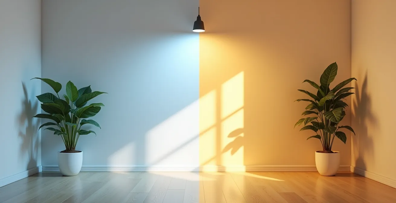
However, for a north-facing room, two other LED metrics are even more critical: Color Temperature (measured in Kelvin) and Color Rendering Index (CRI). To counteract the cool, blueish northern light, you must choose bulbs with a warm color temperature. Here are the key selection criteria:
- Choose Warm Temperature: Select LEDs with a color temperature between 2700K and 3000K. This range produces a warm, inviting, yellowish light similar to traditional incandescent bulbs. Avoid “daylight” bulbs (5000K+), which emit a harsh, blue light that will only exacerbate the cold feeling of the room.
- Demand High CRI: The Color Rendering Index (CRI) measures a bulb’s ability to display colors accurately. For a room where light is already challenging, a high CRI is non-negotiable. Look for bulbs with a CRI of 90+ to ensure your furniture, art, and paint colors look true and vibrant.
- Implement Layered Lighting: Use a mix of ambient (ceiling fixtures), task (reading lamps), and accent (spotlights on art) lighting to create depth and flexibility. Dimmable LEDs are essential for adjusting the mood from bright and functional to soft and cozy.
Which Color Palettes Promote Relaxation in a Master Bedroom?
While this question specifies the master bedroom, the underlying principles of color psychology are universally applicable and particularly relevant for creating a serene and inviting atmosphere in a north-facing living room. The goal is to select a palette that not only counteracts the cool quality of the light but also promotes a sense of calm and comfort. The cool, low-contrast light of a north-facing room can make certain colors feel draining, so the palette must be chosen with intention to add warmth and life.
To achieve a relaxing atmosphere, architects and designers often turn to three families of color palettes that work exceptionally well in cool lighting conditions. First, warm neutrals are a foundational choice. Instead of stark, cool whites, opt for whites, beiges, and greiges with distinct yellow, pink, or red undertones. These undertones are activated by the cool northern light, creating a balanced and creamy warmth that feels enveloping rather than sterile. Think of colors like ivory, soft cream, or a warm “mushroom” gray.
Second, nature-inspired palettes are highly effective. Colors drawn from the natural world have an inherently calming effect. This includes soft, earthy tones like sage green, terracotta, or a muted, dusty blue. In a north-facing room, these colors can prevent the space from feeling disconnected from the outdoors. A soft sage green, for example, can absorb the coolness of the light and create a tranquil, garden-like feel. Finally, deep, saturated jewel tones used as accents can add a layer of sophisticated coziness. A deep navy, forest green, or rich burgundy on a single accent wall, a sofa, or in textiles can create pockets of intimacy and warmth. These dark colors absorb light, creating a feeling of being embraced, which can be profoundly relaxing in a large or sparsely furnished room.
Key Takeaways
- Master light reflection by using high-sheen paints (satin or semi-gloss) and strategically placing mirrors on walls adjacent to windows.
- Control light at the source by layering sheer curtains for diffusion with versatile blinds (like top-down/bottom-up) for privacy and direction.
- Choose artificial lighting with scientific precision: use warm-temperature LEDs (2700K-3000K) with a high CRI (90+) to counteract cool northern light and render colors accurately.
When to stop drinking coffee to ensure it doesn’t ruin your deep sleep?
After meticulously sculpting the natural and artificial light and perfecting the color palette, the final layer in creating a truly restorative living space is to consider how your personal habits interact with the environment. A beautifully designed room is only as effective as your ability to be present and well-rested within it. The calm, dim light of a north-facing room can have a subtle effect on our circadian rhythm, and this makes our lifestyle choices, particularly regarding stimulants like caffeine, even more impactful.
Caffeine has a half-life of approximately 5 to 6 hours, meaning it takes that long for your body to eliminate just half of the caffeine you consumed. If you have a cup of coffee at 3 PM, half of that caffeine is still active in your system at 8 or 9 PM, precisely when your body should be winding down for sleep. This can significantly disrupt your ability to fall asleep and, more importantly, can reduce the amount of deep, restorative sleep you get. In a living space designed for relaxation, being wired and unable to unwind is counterproductive to the entire design intent.
To ensure your living environment can deliver its full restorative potential, a disciplined approach to caffeine is essential. As a general rule, it’s wise to stop all caffeine consumption at least 8 to 10 hours before your intended bedtime. For someone who goes to bed at 11 PM, this means the last cup of coffee or caffeinated tea should be no later than 1 PM to 3 PM. This creates a sufficient buffer for your body to metabolize the stimulant, allowing your natural sleep signals to take over in the evening. By aligning your personal habits with the calming atmosphere you’ve created, you complete the holistic design of a space that supports well-being on every level—from the photons bouncing off the walls to the quality of your rest.
By applying these principles of light science and thoughtful design, you can begin to transform your north-facing living room from a challenge into your favorite room in the house. Start by evaluating a single element—be it your window treatments, a paint color, or your lighting—and make one intentional change.