Contrary to popular belief, the key to a relaxing bedroom isn’t just picking a “calm” color; it’s about orchestrating a neuro-aesthetic dialogue between color, light, and texture to actively soothe your nervous system.
- Activating colors like vibrant reds physiologically increase heart rate, while cool tones like blue have been shown to lower it.
- The “true” color of a paint is revealed not in daylight, but under the artificial evening light in which you’ll actually be sleeping.
Recommendation: Base your color choice on its interaction with your room’s specific lighting and your personal emotional response, not on fleeting annual trends.
Creating a sanctuary for rest goes far beyond simply choosing a bed. For homeowners renovating their master bedroom, the goal is often singular: to cultivate an atmosphere of profound relaxation that paves the way for better sleep. We intuitively understand that color impacts mood, but the science behind it is far more specific and powerful than many realize. Often, we hear generic advice to use pastels or avoid brights, yet this overlooks the intricate relationship between color, light, and our own physiology.
The journey to a restorative space is not about following a simple color-by-numbers chart. It’s about becoming a curator of your own sensory experience. It involves understanding why a vibrant red can genuinely elevate your stress levels, while a specific shade of blue can physically calm you down. This guide delves into this neuro-aesthetic dialogue. We will move beyond the platitudes to explore the scientific underpinnings of color psychology, offering a framework for making intentional choices that serve your well-being.
This is not just about aesthetics; it’s about crafting an environment that works in harmony with your body’s natural rhythms. We will explore how the direction of your windows changes a color’s personality, how to use accents without creating visual noise, and why the finish of your paint is as important as its hue. By the end, you will be equipped to design a bedroom that is not only beautiful but also a powerful tool for achieving deeper, more restorative sleep.
This article provides a structured approach to mastering the art and science of relaxing bedroom colors. From foundational principles to nuanced details, each section builds upon the last to give you a complete toolkit for your renovation project.
Summary: Which Color Palettes Promote Relaxation in a Master Bedroom?
- Why painting a bedroom red raises your heart rate and hinders sleep?
- Cool Blue vs. Warm Beige: Which is better for a north-facing bedroom?
- How to use an accent color without overwhelming the relaxing vibe?
- The “Color of the Year” mistake that looks dated in 12 months
- When to view your paint swatches to see the true color?
- The matte paint mistake that absorbs light instead of bouncing it
- When to stop drinking coffee to ensure it doesn’t ruin your deep sleep?
- Why Choosing Natural Textiles for Bedding Improves Sleep for Sensitive Skin?
Why painting a bedroom red raises your heart rate and hinders sleep?
The impact of color on our state of being is not merely psychological; it is deeply physiological. When we consider a color like vibrant red for a bedroom, we are introducing a powerful stimulant into a space intended for rest. Red is associated with energy, passion, and alarm. Its long wavelength is one of the most visible in the spectrum, demanding attention from our brain and triggering a genuine, measurable physical response. It can elevate blood pressure and increase heart rate, signaling to the body that it should be alert and ready for action—the very opposite of what’s needed for sleep.
In contrast, colors on the cooler end of the spectrum, such as blue, have a profoundly different effect. A growing body of research even suggests that the color blue can reduce heart rate and blood pressure. The receptors in our eyes that communicate with our brain’s circadian rhythm hub are most sensitive to blue light. This doesn’t mean a bright, electric blue, but rather soft, muted tones that evoke a sense of calm and stability, reminiscent of a clear sky or serene waters. As a 2018 study from the University of Sussex found, exposure to certain colors can actively reduce stress levels and promote relaxation.
However, the narrative is not a simple “blue is good, red is bad.” The specific shade and saturation matter immensely. A dark, overpowering navy can create a somber atmosphere if not balanced correctly.
Darker shades of blue can sometimes evoke negative feelings such as sadness, loneliness, and defeat
– Jay Summer, Sleep Foundation Health Content Writer
The key is to select a color that promotes a state of passive tranquility rather than active stimulation or deep melancholy. The goal is to send a gentle signal to your nervous system that it is time to power down, a signal that a color like red actively fights against.
Cool Blue vs. Warm Beige: Which is better for a north-facing bedroom?
Choosing a color for a north-facing bedroom presents a unique challenge that highlights the critical interplay between hue and light. North-facing rooms receive no direct sunlight, only indirect, diffuse light. This light has a cooler, bluer chromatic temperature than the warm, yellow light from a southern exposure. Understanding this is the key to avoiding a common design mistake: a room that feels cold, drab, and uninviting.
When you paint a north-facing room with a cool color, like a classic light blue or gray, the cool natural light will amplify those undertones. The blue you loved on the paint chip can suddenly appear sterile, icy, or even somber. While blue is inherently relaxing, in this context, it can create a chilly, unwelcoming atmosphere that is counterproductive to comfort. This is where a strategic shift to warmer tones can make all the difference.
A warm beige, a creamy off-white, or a soft greige with yellow or pink undertones will counteract the coldness of the northern light. These warm hues absorb the cool light and radiate a gentle warmth, making the space feel cozier and more balanced. The color essentially “corrects” the light, creating an environment that feels welcoming and serene rather than stark. The illustration below demonstrates how these two color families behave in this specific lighting condition.
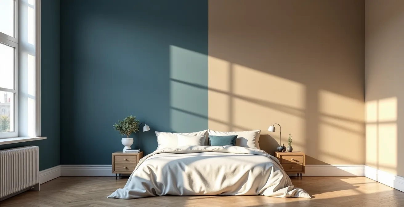
As you can see, the warm beige creates a more enveloping and comforting glow, while the cool blue, though beautiful in its own right, can feel much more detached in this light. The choice isn’t about which color is “better” in a vacuum, but which color performs better in a specific, light-challenged environment to achieve the ultimate goal of relaxation.
How to use an accent color without overwhelming the relaxing vibe?
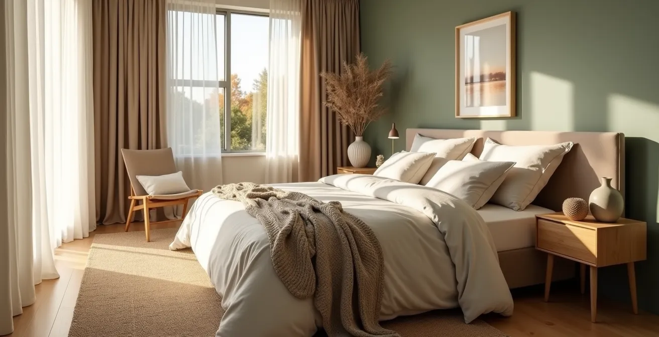
Many homeowners fear that a purely neutral or monochromatic bedroom will feel boring, yet they worry that adding an accent color will disrupt the tranquil atmosphere they’re trying to create. The solution lies not in avoiding accents, but in applying them with discipline and intention. The most reliable framework for this is the classic 60-30-10 rule, a principle that ensures balance and harmony in any space.
Interior design experts and psychologists agree that this ratio creates a visually pleasing and coherent environment. As recommended by design professionals, you should dedicate 60% of a room’s color to a dominant hue, 30% to a secondary color, and 10% to an accent color. This creates a clear visual hierarchy that feels organized and calm, not chaotic. For a bedroom, your 60% is typically a soft, neutral color for the walls. The 30% might be your bedding or curtains in a slightly deeper or complementary tone. The final 10% is your accent—just enough to add personality without shouting.
The table below breaks down how to apply this rule in a relaxing bedroom context.
| Percentage | Color Role | Application Areas | Example Colors |
|---|---|---|---|
| 60% | Primary/Dominant | Walls, ceiling, large furniture | White, soft gray, beige |
| 30% | Secondary | Furniture, flooring, curtains | Natural wood, deeper gray |
| 10% | Accent | Throw pillows, artwork | Soft pink, sage green |
Furthermore, an “accent” doesn’t have to be a bold, contrasting color. In a restorative bedroom, the most sophisticated accents are often textural rather than chromatic. Instead of a bright yellow pillow, consider a throw blanket in a deep, rich velvet or a chunky wool knit in the same color family as your walls. This creates a sensory hierarchy, adding depth and interest for the eye without introducing jarring visual information that can disrupt a calm state.
By using the 60-30-10 rule and considering texture as your “10%,” you can build a layered, sophisticated palette that is both personally expressive and deeply conducive to rest.
The “Color of the Year” mistake that looks dated in 12 months
Each year, paint companies and trend forecasters announce a “Color of the Year,” creating a wave of excitement in the design world. While these colors can be inspiring for accessories or temporary updates, committing to one for your bedroom walls is a significant psychological and financial mistake. The core purpose of these trends is commercial—to drive new sales. They are, by definition, fleeting and designed to be replaced, which is the antithesis of the stable, serene environment needed for a master bedroom.
A color’s ability to promote relaxation is tied to its inherent qualities and your personal connection to it, not its temporal relevance. A trendy, vibrant coral or a specific, unusual green might look fresh on a magazine cover, but its novelty will quickly fade. In a year or two, it will no longer feel current but simply dated, creating a subtle sense of visual discord. A truly restorative bedroom should feel timeless—a personal sanctuary detached from the fast-paced cycle of consumer trends.
Instead of looking outward to trends, the selection process should be an inward journey. Focus on colors that have a classic, enduring appeal and, most importantly, evoke a positive emotional response in you. This might be a soft sage green that reminds you of nature, a gentle off-white that feels clean and airy, or even a deep, enveloping navy that feels like a protective cocoon. As one designer notes, the shift is toward more personal, lasting choices.
warm neutrals are the new gray
– Kelsey Fischer, Havenly Designer
This statement reflects a move away from a single, ubiquitous trend (cool grays) toward a broader, more classic family of colors that offer warmth and longevity. To avoid the trend trap, build your palette around what feels genuinely calming to you, not what you’re told is in style this season.
Action Plan: Selecting a Timeless Bedroom Color
- Broaden your palette: Look beyond predictable pastels. A rich, cocooning navy or a deep aubergine might be your personal version of “calm.”
- Conduct light tests: Observe your chosen color swatches at different times of the day—morning, noon, and evening—to see how they transform.
- Trust your gut: Choose the color that elicits a genuine emotional response of peace and comfort, regardless of current trends.
- Focus on the mood: Ask yourself, “What feeling do I want to have in this room?” and let the answer guide your color choice, not a brand’s marketing.
- Integrate with existing elements: Ensure your new wall color harmonizes with your flooring, furniture, and textiles for a cohesive, timeless look.
When to view your paint swatches to see the true color?
One of the most common and costly mistakes in bedroom renovation is choosing a paint color based on how it looks at the hardware store or on your wall in the bright light of day. A bedroom is primarily an evening space, a room you retreat to as the sun goes down and where you wake up in the gentle morning light. The color’s performance under artificial lighting is therefore far more critical to its success as a relaxing agent than its daytime appearance.
Daylight, especially direct sunlight, is full-spectrum and tends to wash out colors, making them appear brighter and less saturated. The “true” personality of a color, particularly in the context of relaxation, is revealed under the warm, focused glow of your bedside lamps and the softer ambient light from overhead fixtures. A beige that looked perfectly neutral at noon might reveal an unflattering greenish or pinkish undertone at night. A gray could suddenly feel cold and stark. As design experts emphasize, evening is the moment of truth.
The Evening Light Test: An Expert Method
Professional interior designers from Decorilla advocate for a rigorous testing method focused on evening conditions. Their process confirms that testing a swatch in morning light alone is insufficient for a space dedicated to rest. For genuinely relaxing bedroom colors, they insist on checking the hues in the evening, observing how they behave under both overhead light and the specific illumination from bedside lamps. This reveals the color’s warm or cool shifts and ensures the nighttime ambiance is precisely what you intended: calm, enveloping, and conducive to sleep.
This meticulous testing process is what separates a merely “painted” room from a thoughtfully designed sanctuary. It’s the final, crucial step to ensure the color theory translates into reality. This is particularly important when using colors like blue, as its relaxing properties are most effective when the shade is just right. Indeed, surveys suggest that people sleeping in blue rooms tend to enjoy longer, more restful sleep—a benefit you want to secure by ensuring the color is perfect in its primary use-case scenario: the evening.
The matte paint mistake that absorbs light instead of bouncing it
The choice of paint color is only half the battle; the finish you select plays an equally important role in the final neuro-aesthetic experience of the room. Paint finishes range from flat/matte to high-gloss, and each interacts with light differently. For a bedroom, where the goal is a soft, soothing atmosphere, a matte finish is often the default choice. It has a non-reflective, velvety surface that is excellent at hiding minor wall imperfections. More importantly, it absorbs light rather than bouncing it around.
This quality of luminous absorption is what gives matte walls their signature soft, deep, and enveloping feel. It reduces glare from lamps and windows, creating a tranquil, low-stimulation environment that helps the mind unwind. In contrast, higher-sheen finishes like eggshell, satin, or semi-gloss reflect light. While useful in high-traffic areas for durability, this reflectivity can create a subtle, clinical harshness in a bedroom. The bright spots and glare can be visually distracting and work against the goal of creating a restful cocoon.
However, the success of a matte finish is conditional. Because it doesn’t reflect light, it can make a room feel darker and smaller if not used thoughtfully. The key to maximizing its calming potential is to pair it with texture.
This is one of those relaxing bedroom colors that look best surrounded by texture, because smooth surfaces will reflect too much and make the wall color feel colder than it is
– Decorilla Design Team, Decorilla Online Interior Design
By introducing textures through linen bedding, a wool rug, or woven curtains, you create subtle variations in how light is absorbed and shadowed across different surfaces. This prevents the matte walls from feeling flat and lifeless, instead creating a rich, layered, and tactile environment that is profoundly comforting.
When to stop drinking coffee to ensure it doesn’t ruin your deep sleep?
Crafting the perfect, color-optimized sleep sanctuary is a powerful step, but it can be completely undermined by lifestyle habits that work against your body’s natural sleep cycle. The most common culprit is caffeine. While a morning coffee can feel essential, consuming it too late in the day can sabotage the restorative effects of your beautifully designed bedroom. The key is understanding caffeine’s half-life.
The half-life of a substance is the time it takes for the body to eliminate 50% of it. For caffeine, this duration is surprisingly long. According to sleep science, caffeine’s half-life is approximately 5-7 hours. This means that if you drink a cup of coffee at 3 PM, half of that caffeine could still be circulating in your bloodstream at 8 PM or even later, actively blocking the adenosine receptors in your brain that signal sleepiness. Even if you manage to fall asleep, the quality of that sleep, particularly the deep, restorative stages, will be compromised.
To ensure your calming bedroom environment can do its job, establishing a strict caffeine cutoff time is non-negotiable. For most people, this means avoiding all caffeine (including coffee, black tea, and many sodas) after 2 PM. This gives your body ample time to process the stimulant before you begin your wind-down routine in the evening. By aligning your habits with your design goals, you create a powerful synergy for better rest.
Consider replacing your afternoon coffee with a beverage that actively promotes relaxation. This not only avoids the stimulant but also creates a new, positive sleep-associated ritual. Here are some effective alternatives:
- Chamomile-Lavender Tea: A classic herbal combination known for its calming properties.
- Golden Milk: Warm milk with turmeric, which has anti-inflammatory benefits that can promote comfort.
- Tart Cherry Juice: A natural source of melatonin, the hormone that regulates the sleep-wake cycle.
Key Takeaways
- The goal is not just aesthetic appeal but physiological calm; choose colors that lower your heart rate, not activate it.
- Light is an active ingredient: Always test colors in your room’s specific natural and artificial light conditions, especially in the evening.
- Timelessness trumps trends. Select colors based on your personal emotional response to create a lasting sanctuary.
Why Choosing Natural Textiles for Bedding Improves Sleep for Sensitive Skin?
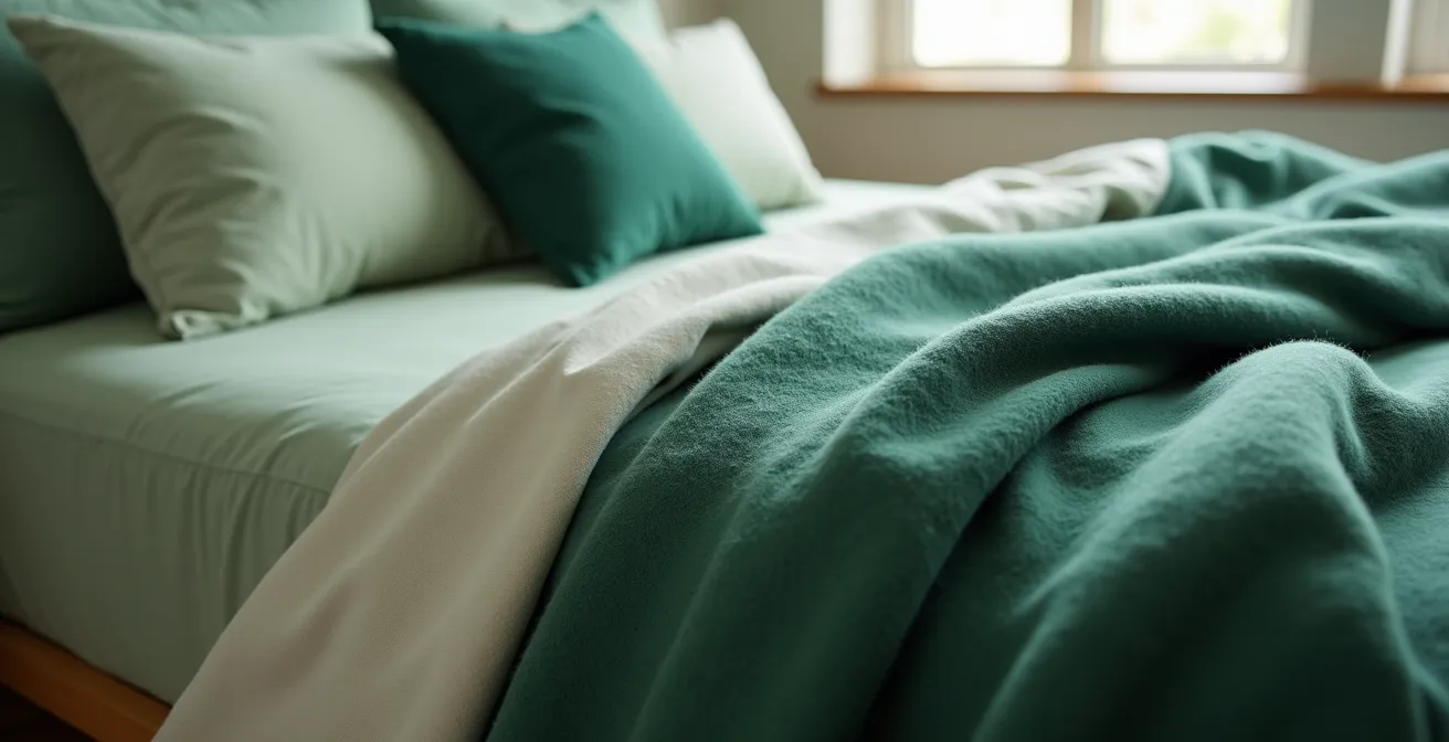
The final layer of your sleep sanctuary is the one you interact with most intimately: your bedding. While the visual calm of your color palette sets the stage, the tactile experience of your textiles completes the sensory journey to relaxation. For those with sensitive skin, or anyone seeking optimal comfort, the choice of fabric is paramount. Natural fibers like cotton, linen, and Tencel offer benefits that synthetic materials simply cannot match.
The primary advantage of natural textiles is their breathability and moisture-wicking capability. Materials like polyester are essentially plastic; they trap heat and moisture against your skin. This can lead to overheating, night sweats, and irritation, disrupting sleep and exacerbating conditions like eczema or general sensitivity. In contrast, natural fibers like cotton and linen allow air to circulate freely and pull moisture away from the body, helping to regulate your temperature throughout the night. This creates a stable, comfortable microclimate that is essential for uninterrupted sleep.
The Synergy of Color and Fiber
As sleep experts at South Shore Fine Linens explain, the effects of color and textiles are deeply intertwined. Choosing calming bedroom colors is the first step in turning your bedroom into a sleep sanctuary where you can rest and recharge. The color scheme affects everything from your appetite to your blood pressure. However, this visual calm is amplified by physical comfort. Natural fibers complement these calming colors by providing superior breathability and temperature regulation, ensuring that the serene mood created by the palette is not broken by physical discomfort during the night.
By completing your sensory hierarchy—from the 60% wall color to the 30% curtains down to the final 10% of tactile bedding—with high-quality natural fibers, you create a holistic environment. You are sending a consistent, multi-sensory signal to your brain and body that this space is safe, comfortable, and optimized for deep, restorative rest. It’s the final, crucial detail that transforms a well-decorated room into a true sleep sanctuary.
By thoughtfully applying these principles of color psychology, light interaction, and material selection, you can now move forward with the confidence to design a master bedroom that is not just aesthetically pleasing, but a true instrument for enhancing your sleep and overall well-being.