Contrary to popular belief, fighting ‘Zoom fatigue’ isn’t about using more tools, but about designing experiences that counteract the cognitive distance of virtual learning.
- Passive slide-watching leads to abysmal retention because it overloads cognitive capacity without active processing.
- Awkward breakout rooms and low empathy are not accidents; they are symptoms of a failure to design for psychological safety and emotional connection online.
Recommendation: Shift your focus from being a tool operator to an engagement architect, strategically managing attention, cognition, and emotion throughout your sessions.
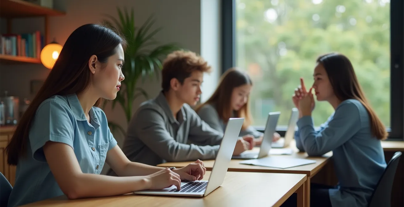
You’ve seen it. The 20-minute mark hits in your online session, and a virtual wall goes up. The active chat goes silent, cameras mysteriously switch off, and you’re left talking to a grid of static profile pictures. You’ve tried all the standard advice: launch a poll, ask a question, use more visuals. Yet, the disengagement persists, leaving you feeling more like a broadcaster than an educator. This struggle with “Zoom fatigue” and silent audiences isn’t a reflection of your teaching ability; it’s a sign that the old rules of engagement don’t apply here.
The common playbook focuses on tactical add-ons—sprinkling in quizzes or creating breakout rooms—but fails to address the fundamental challenge. The real issue is the invisible cognitive and emotional distance created by digital screens. We’re fighting against a reduced ’emotional bandwidth’ and an overloaded ‘cognitive load’ that are the default settings of remote communication. Passively watching slides isn’t just boring; it’s neurologically inefficient for learning.
But what if the solution wasn’t adding more distractions, but redesigning the entire learning flow? What if you could become an architect of engagement, intentionally structuring your sessions to manage attention, foster psychological safety, and build genuine connection, even through a screen? This guide moves beyond the superficial tips. We will deconstruct the ‘why’ behind online disengagement and provide you with a new framework for creating sessions that don’t just hold attention, but actively build it.
This article provides a detailed roadmap for transforming your remote teaching. Below, you will find a summary of the key strategies we’ll explore, from the science of retention to the art of designing for human connection in a digital world.
Summary: The New Rules for Engaging Remote Students
- Why passively watching slides results in only 10% retention?
- Polls vs. Quizzes: Which interactive tool wakes up a sleepy class faster?
- The grouping mistake that turns breakout rooms into awkward silence
- How to design slides that work on a mobile screen for commuting students?
- When to schedule the most complex topic in a 90-minute webinar?
- Why you can’t “feel” someone’s pain as deeply over a Zoom call?
- Miro vs. Mural: Which tool lowers the barrier for introverted creatives?
- How Digital Interactions Weaken Our Ability to Read Facial Expressions?
Why passively watching slides results in only 10% retention?
The “death by PowerPoint” phenomenon is more than just a cliché; it’s a cognitive reality. When students are forced into a passive role, simply watching slides go by, their ability to retain information plummets. This isn’t about a lack of willpower; it’s about how the brain is wired. Passive learning methods, like listening to a lecture or watching a presentation without interaction, create a high cognitive load without providing the mechanisms for encoding information into long-term memory. The brain is busy processing the raw visual and auditory data, but it’s not actively connecting it to existing knowledge or creating new neural pathways.
The numbers are stark. While active eLearning methods can boost retention significantly, traditional, passive training tells a different story. The Research Institute of America discovered that in face-to-face training environments relying on passive listening, retention rates can be as low as 8% to 10%. The reason is simple: with active learning, students gain control. They can pause, reflect, and revisit material, moving from being passive recipients to active participants in their own education. Without this, the information presented on slides remains transient, failing to make a lasting impact.
To break this cycle, every slide should be seen as a prompt for an action, not a repository of information. The goal is to shift the student’s role from a spectator to a co-creator of the learning experience. This means transforming information delivery into an interactive loop of presentation, question, and response, ensuring the brain is always working to process, not just to receive. The implication is clear: if your students are just watching, they are likely not learning.
Polls vs. Quizzes: Which interactive tool wakes up a sleepy class faster?
When you sense the energy dipping in a virtual classroom, you need a quick, effective way to reboot the collective attention. Both polls and quizzes are popular choices, but they serve different cognitive purposes. A quiz, with its right-or-wrong format, tests knowledge and can sometimes induce anxiety, making some learners hesitate. A poll, however, is a low-stakes invitation to share an opinion or experience. It’s the fastest way to wake up a sleepy class because it prioritizes participation over performance, creating instant psychological safety.
The data supports this engagement-first approach. A comprehensive study in Frontiers in Education found that over 70% of students reported higher engagement when instructors used polls during class. Polls act as a pattern interrupt, breaking the monologue of a lecture and giving every student a voice simultaneously and safely. This simple act of participation re-engages the brain and makes learners feel seen and included. As researchers Susanne Voelkel and Daimark Bennett noted, the effect is both emotional and cognitive.
As Voelkel and Bennett highlight in their research, polls are more than just a fun gimmick. They stated in *Innovations in Education and Teaching International*:
Students thought the polls were fun and a good way to break up the lecture and make it more interesting. More importantly, they perceived the phone polls as engaging, making them think and providing feedback on their learning
– Susanne Voelkel & Daimark Bennett, Innovations in Education and Teaching International, 2014
Therefore, while quizzes have their place for assessing comprehension, a poll is the superior tool for a rapid energy boost. Use it to kick off a topic, check the room’s opinion mid-lecture, or quickly gather insights. It’s a simple, powerful tool of interaction design that transforms passive listeners into active contributors in a matter of seconds.
The grouping mistake that turns breakout rooms into awkward silence
Breakout rooms are the go-to tool for fostering small-group collaboration, but they often backfire, resulting in painful silence and disengaged participants. The single biggest mistake is the lack of structure. Simply pushing students into a room with a vague prompt like “discuss this topic” creates a social vacuum. Without clear roles or a defined objective, no one feels empowered to take the lead, and everyone defaults to waiting for someone else to speak. This is a failure of interaction design, not a failure of the students.
The solution is to architect the experience by assigning specific, rotating roles and a concrete deliverable. This immediately removes the social ambiguity and gives each person a clear purpose. Instead of a free-for-all, the breakout room becomes a focused team with a mission. The ‘awkward silence’ is replaced by productive conversation because everyone knows what they are supposed to be doing. This structure builds psychological safety, as contributing is no longer a social risk but the fulfillment of an assigned duty. A well-designed breakout room isn’t just a space; it’s a system for collaboration.
Implementing this system requires minimal effort but yields maximum results. By providing this scaffold, you empower students to self-manage and engage deeply with the material and each other. The following checklist outlines the key elements to assign before you ever click the “Create Rooms” button, transforming your breakouts from a gamble into a guaranteed success.
Action Plan: Designing Breakout Rooms That Actually Work
- Assign a Facilitator: This person’s job is to keep the conversation flowing, ask questions, and ensure everyone has a chance to contribute.
- Designate a Time-Keeper: This role is responsible for monitoring the clock, providing warnings (e.g., “We have 2 minutes left”), and keeping the group on task.
- Appoint a Note-Taker: This individual documents the group’s key ideas, questions, and conclusions in a shared document like Google Docs or a Miro board.
- Select a Reporter: This person is tasked with summarizing the group’s main findings and reporting back to the main session when the rooms close.
- Define a Concrete Deliverable: Give a clear, time-bound task. For example, “Create a 3-bullet-point summary in the shared doc within the next 7 minutes.”
How to design slides that work on a mobile screen for commuting students?
In our hyper-mobile world, assuming every student is watching on a large monitor is a critical error. Many are learning on the go—on a bus, during a lunch break, or simply on their phone in another room. For these learners, a dense, text-heavy slide designed for a desktop is not just ineffective; it’s unusable. The rise of mobile learning is undeniable, with recent data showing that 57% of American students relied on digital tools for their education, with a significant portion using mobile devices.
Designing for a mobile screen requires a “mobile-first” mindset, which prioritizes clarity and glanceability above all else. This isn’t about “dumbing down” content; it’s about optimizing its delivery to reduce cognitive load. On a small screen, every extraneous element is a distraction. The key is to treat each slide as a visual billboard, not a page in a textbook. It should support your spoken words, not replace them. The goal is for a student to glance at their phone for three seconds and grasp the single, core idea of the slide.
This means embracing minimalism and high contrast. Think big fonts, single concepts, and interactive elements placed where a thumb can easily reach them. Captions should be on by default to accommodate noisy environments. By following these principles, you ensure your content is accessible and effective for every student, regardless of their device or location. This isn’t just good design; it’s inclusive design.
- Use a large font size: A minimum of 30pt is essential for readability on small screens.
- One idea per slide: Enforce strict message discipline to ensure the core concept is instantly understandable.
- Extreme contrast: Use black text on a white background or vice versa. Avoid subtle color combinations like gray on blue, which fail in bright lighting.
- Thumb-friendly design: Place clickable links or poll buttons in the center-bottom of the screen for easy one-handed navigation.
- Slides as visual aids: Your slides should be a visual anchor to your audio narrative, not a script for you to read.
- Captions by default: Commuting students are often in loud places; built-in captions make your content accessible everywhere.
When to schedule the most complex topic in a 90-minute webinar?
Structuring a 90-minute webinar is an exercise in managing the collective attention economy of your audience. Attention is not a constant; it ebbs and flows. Throwing your most complex topic at the beginning can overwhelm learners before they’re warmed up, and saving it for the end means you’re fighting against peak mental fatigue. Educational psychology research shows this clearly; students can experience significant attention lapses, sometimes for up to 5 minutes at a time, making timing crucial.
The most effective strategy is to treat your session like a narrative with a climax. Research on online learning attention spans suggests that individual content segments should be kept short, ideally under 10 minutes, to maintain focus. Within a longer 90-minute session, the most cognitively demanding material should be positioned as the ‘peak’ of the experience. According to the “55-60 minute climax model,” this is the ideal window. By this point, you have spent the first hour building foundational knowledge, rapport, and engagement. The audience’s cognitive energy is primed and fully invested.

Introducing your most complex topic around the 55 to 60-minute mark capitalizes on this peak moment of collective focus. However, this peak is fragile. The intense cognitive effort must be immediately followed not by more lecturing, but by a carefully designed interactive activity. This could be a breakout room task, a collaborative whiteboard session, or a problem-solving quiz. This immediate application helps consolidate the complex information, transferring it from short-term to long-term memory and releasing the built-up cognitive tension. By architecting this flow, you guide your students through difficulty instead of losing them to it.
Why you can’t “feel” someone’s pain as deeply over a Zoom call?
If you’ve ever felt a strange sense of disconnection or a muted sense of empathy during a virtual meeting, you’re not imagining it. Digital interactions, for all their convenience, operate on a lower emotional bandwidth than face-to-face communication. This “digital empathy deficit” stems from the absence of subtle, non-verbal cues that our brains rely on to build connection. As Georgetown’s Center for New Designs in Learning found, the lack of real-time micro-expressions and shared physical space prevents our mirror neuron systems from fully activating, which are essential for experiencing empathy.
Our brains are wired for co-location. When we share a physical space with someone, our bodies and brains begin to subtly synchronize. This biological process is a cornerstone of deep emotional connection and understanding. Virtual calls, however, strip away this crucial layer of communication. Neuroscience research has shown the profound biological impact of this separation.
The lack of physical co-location in digital interactions prevents the biological synchronization of brainwaves and physiological states like heart rates between individuals, which normally fosters deeper emotional connection
– Neuroscience research findings, Research on mirror neurons and shared presence
This means we can intellectually understand that a student is struggling, but we can’t *feel* it with the same depth. The emotional data is filtered and compressed by the screen. Recognizing this limitation is the first step for any online educator. It requires us to be more explicit in our communication, to create structured opportunities for sharing emotions (like regular check-ins), and to acknowledge that the screen creates a very real, physiological barrier to human connection. We must consciously work to rebuild the empathetic bridges that technology dismantles by default.
Miro vs. Mural: Which tool lowers the barrier for introverted creatives?
Digital whiteboards like Miro and Mural have become essential for visual collaboration, but they are not created equal, especially when it comes to fostering psychological safety for all personality types. For introverted creatives, who often prefer to think before they speak, the design of the tool can be the difference between enthusiastic participation and silent observation. The “blank canvas anxiety” of an unstructured, infinite board can be paralyzing. The key is to choose a tool that provides structure and privacy.
While both platforms are powerful, Mural often has an edge in creating a more inviting environment for introverts. Its features are inherently more structured and facilitator-controlled, which reduces the social pressure and unpredictability that can stifle quieter voices. For example, Mural’s template-driven approach provides a clear starting point, its “private mode” allows individuals to gather their thoughts before sharing with the group, and its anonymous voting feature lets people contribute ideas without fear of immediate judgment.
This comparison shows how seemingly small feature differences can have a huge impact on inclusion and engagement. The goal is to create an environment where the best ideas can surface, regardless of who they come from. By choosing a tool with features that promote predictability and private ideation, you lower the barrier to entry for introverted students and unlock a wider range of creative contributions.
This comparative analysis, based on a framework from recent educational technology surveys, highlights the specific features that impact introverted learners.
| Feature | Miro | Mural | Impact for Introverts |
|---|---|---|---|
| Canvas Style | Infinite, unstructured | Template-driven, structured | Mural’s structure reduces ‘blank canvas anxiety’ |
| Privacy Features | Open by default | Private mode available | Mural allows thinking before sharing |
| Facilitator Control | Basic controls | Super lock, summoning features | Mural creates predictable environment |
| Anonymous Features | Limited | Built-in anonymous voting | Mural reduces social pressure |
Key takeaways
- Passive learning is neurologically inefficient; retention plummets because it overloads cognition without active processing.
- The best engagement tools (like polls) lower the barrier to participation and build psychological safety, prioritizing involvement over performance.
- Effective online learning requires you to be an ‘engagement architect,’ strategically managing attention, cognition, and emotion rather than just operating tools.
How Digital Interactions Weaken Our Ability to Read Facial Expressions?
Video calls give us the illusion of face-to-face communication, but they are a low-resolution substitute for the real thing. Our brains are exquisitely tuned to perceive micro-expressions—fleeting facial movements lasting just a fraction of a second that betray our true feelings. These subtle cues are a vital part of our emotional and social intelligence. However, due to video compression, lag, and poor lighting, these critical data points are often filtered out or distorted during virtual interactions.
This leads to a phenomenon of “micro-expression atrophy.” Research that examined student-instructor interactions during the rapid shift to online learning revealed this troubling trend. By relying heavily on this filtered, low-fidelity emotional data, our ability to perceive subtle non-verbal cues begins to weaken over time. We start to miss the flash of confusion, the flicker of doubt, or the suppressed smile that would be obvious in person. This not only hinders our ability to respond appropriately in the moment but can also degrade our face-to-face interaction skills when we return to in-person settings.
As educators, we must actively work to counteract this effect. This means intentionally building “emotional literacy” exercises into our sessions to retrain our and our students’ focus on non-verbal cues. It’s about consciously practicing the skill of reading the digital room. By doing so, we can help mitigate the negative impact of screen-based communication and maintain a higher level of social and emotional awareness for everyone involved.
- Emotion Polls: Show images of ambiguous facial expressions and have students vote on the emotion being displayed. Discuss the results.
- Nuanced Check-ins: Move beyond a simple thumbs-up. Use an “emotion wheel” or a word cloud to have students describe their current state more precisely.
- Micro-expression Practice: Use specialized tools or short videos in a non-graded, fun context to practice identifying fleeting expressions.
- Strategic “Video-On” Moments: Instead of a “video-on” mandate, create short, purposeful activities where seeing each other’s reactions is key to the task.
- Feedback on Tone: Implement structured peer feedback sessions that focus not just on the content of a presentation, but on the perceived emotional tone and its impact.
Now that you understand the core principles behind true remote engagement, the next step is to apply this architectural mindset to your own course design. Start by evaluating one of your existing sessions through this new lens: where can you reduce cognitive load, increase psychological safety, and more intentionally manage your students’ attention and emotional energy?